

Sometimes changing with the time becomes a necessity. Nokia, a Finland based company ,formally HMD Global when arrived in mobile industries created a drastic change in Indian market and left an amazing image of themselves of robust and fine built quality. The iconic logo of Nokia is still fresh in the memories of many users.
As the time demanded the company taken a decision and now arrived the new logo of Nokia.
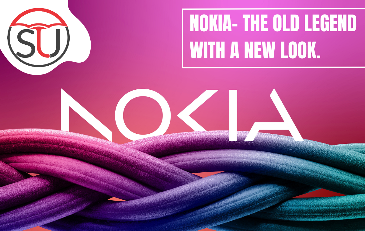
The new logo
During the MWC 2023 event on Sunday, Nokia unveiled its latest brand identity, marking a significant redesign of the company’s logo, which has remained unchanged for almost six decades. Nokia’s roots trace back to its establishment in 1865 as a single paper mill operation.

Credit: Google
The initial logo featured a salmon head, representing the B river where the mill was located and where the company derived its name. Over the years, Nokia has come a long way from its humble beginnings.
Idea behind the Change
Nokia CEO Pekka Lundmark told Bloomberg, “In most people’s minds, we are still a successful mobile phone brand, but this is not what Nokia is about,”. He also added “We want to launch a new brand that is focusing very much on the networks and industrial digitalization, which is a completely different thing from the legacy mobile phones.”
Credit: Google
Also read: Nokia C12 Plus Affordable Smartphone launched: Check Price, Specifications
The innovative Lippincott creative consultancy has crafted a fresh logo for Nokia that presents a collection of delicate lines and circles to form the word itself. However, prevailing market trends are evident as some letters have been intentionally altered to generate negative space.
This approach has been the subject of criticism by a few contributors who feel it hinders the ease of reading. It is interesting to note that the new Nokia logo bears some resemblance to the recently updated emblem of Kia, drawing comparisons from the public.
Nokia and its logo
- 1866:Approximately one year after Fredrik Idestam established wood pulp mills along the Tammerkoski rapids in southern Finland and near the Nokianvirta river, which was the location that would eventually become known as Nokia, the company created its inaugural logo.
Credit: Google
The emblem was fashioned to include a salmon, which is believed to have been influenced by a nearby river in the vicinity of the initial Nokia factory.
- 1898:The manufacturing of rubber was initiated by the company, which subsequently brought about significant changes to its logo. The new design incorporates a prominent red triangle featuring the inscription “1898 S.G.T.O.Y NOKIA”, thus paying homage to the Suomen Gummitehdas Oy rubber factory to which the emblem had previously belonged.
- 1965:The Nokia Corporation comes into existence with a distinctive emblem that features a circular design in black color, bearing the name “Nokia” in capital letters.
- 1967:The brand name “Nokia” is prominently displayed in blue block letters, accompanied by three arrow-shaped icons in the top-right corner that depict mobile phone connectivity to cell towers.
Credit: Google
Over time, several minor modifications have been made to the design, including the removal of the arrow symbols, the addition of the slogan “Connecting People,” subsequent removal of the same, and a change of font to a more streamlined and minimalist sans serif style.
The Microsoft deal 2014
Despite being a prominent player in the mobile industry, Nokia failed to adjust to the advancements of the smartphone market, led by influential companies like Apple and Google. In 2014, the company sold its mobile phone division to Microsoft, however the outcome of the transaction was notably unsatisfactory.
Credit: Google
Nokia’s downward graph
In 2016, Microsoft incurred substantial losses of over $8 billion due to its acquisition and subsequent unsuccessful attempt to compete with iOS and Android in the smartphone market. Also go through GM To Lead Automotive Industry with Microsoft’s ChatGPT AI Technology
Credit: Google
Subsequently, Microsoft began the process of winding down its own smartphone operations. The Nokia mobile brand was later sold to HMD Global, a new entity founded by former Nokia employees, and Nokia smartphones are currently being manufactured by Foxconn subsidiary, FIH Mobile, under their brand name.
The new revenue source
Nokia has diversified its revenue streams to include the marketing of network infrastructure and the licensing of its substantial intellectual property portfolio, including to competitors in the mobile industry.
Additionally, the company has prioritized its investment in 5G technology, with this segment experiencing a positive trajectory due to limitations on the use of equipment from its Chinese counterpart, Huawei.
Also read: US Universities Changing Their Studies Patterns Due to AI Chatbots Use